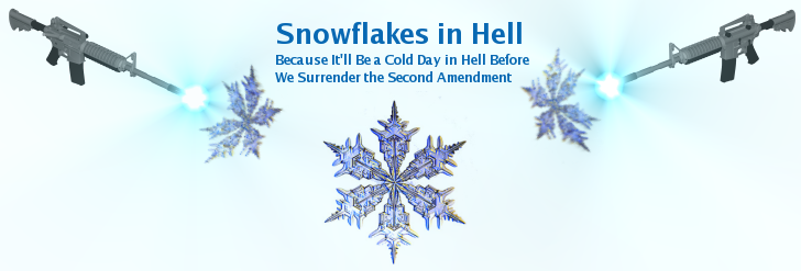
My graphics arts skills leave a lot to be desired. But after thinking a bit about what I wanted, I came up with an idea for a new banner, but I’m not sure I really like it. One of the things I’m trying to achieve is to tie the gun issue in with the graphic, and in with the blog’s title. I originally picked the title of the blog because I was resistant to starting my own blog, despite people telling me I should. So when I started one, it was the proverbial cold day in hell, after my long insistence I had better things to do.
Here’s what I was working on. Let me know what you think. You can tell me it sucks, since I’ll probably agree with you. Anyone is welcome to come up with something better, and if I like it, I’ll owe you some beer.


Might be kinda cool to have a mountain in the background with a snow ball rolling down getting bigger.
The whole snowballing=gaining momentum metaphor.
It’s too busy.
The rough-draft you came up with has a central flow to the middle of the graphic. This doesn’t mesh with the layout of your page where the whitespace and general flow of your blog draws the eye to the left.
In other words, take a look at your current banner. It goes from top-left to bottom-right. On the top of your layout, this works. Your new banner should follow the same or similar style of object flow.
Now it was me I would go photo. Replace Satan on the right-hand corner with some hot woman in a cold-weather outfit with wings and understated horns. On the top left…. well never mind with the model you could stop there and call it done. :-)
I like it. The snow flakes are pretty.
It feels a little odd to be discussing graphic design here of all places, but my comment was that it seemed too symmetrical. Maybe thats me intuiting what Tony explained above. He sounds like he knows what he’s talking about, and I have no clue.
I agree with you guys on the symmetry thing. Once you pointed it out, that’s one thing that bothers me. I’m looking into changing it.
I’d use just one rifle in the bottom left hand corner pointing up toward the middle.
In it’s present form only one kind of rifle is represented. Perhaps work in some other firearms.
What about the hoofed guy with the boxing gloves and the skull shorts? Have you thought about what happens to his family when you give him the “HOOF?”
I agree with the symmetry comments that you already responded to.
In terms of the content of the header, I kind of think of your blog framed a little differently, that the Second Amendment is beginning* (we’ll always have a fight, but we’re winning.. well, till Barack gets elected..) to become more/re- accepted in the view that we share.
So when our society was where gungrabbers thought it was in the 90’s, becoming more and more pc/anti (and in some sectors still is), I think there’s been something of an awakening toward reason. So if the Brady Bunch told you it’d be a cold day in hell before the AW ban was allowed to expire, guess what, I think I see snowflakes in hell!
Why don’t you just add Jimbo or Ned holding a gun somewhere on your current graphic?
I like Laughing Dog’s idea!
Hmm. You need a devil with a gun (“What Would Satan Shoot?” ugh.) I always liked the grinning image of ol’ Scratch on the Red Devil lighter fluid cans. just a thought.